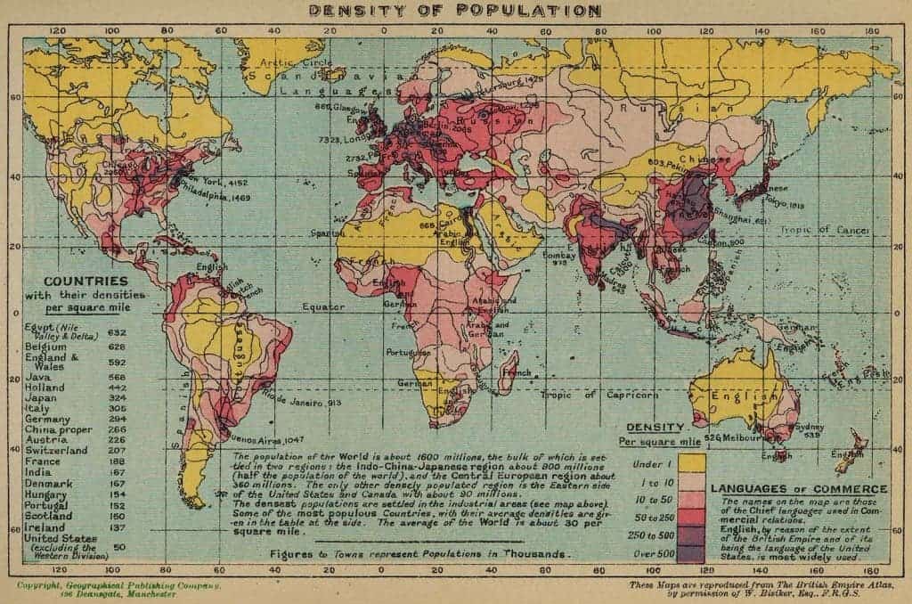
I recently came across a map of the population density done in 1918, and I’d really like to share it with you, as well as discuss some aspects. Here it is:

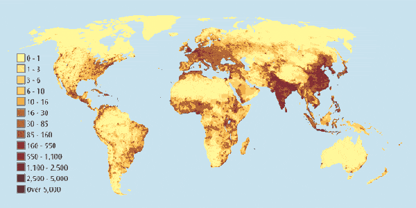
Also, here is a map of the population density now.
At a first glance, they seem strikingly similar, the same yellow (low density) areas, the same red (high density) areas. But look a little closer; hint: look at the scale. The 1918 map varies from 0 to “over 500” people per square mile, while now, the values are in between 0 and over 5000! The population back then, as the map mentions was of 1.6 billion people, while now, we’ve hit over 7 billion for quite a while.
Another thing that’s interesting to observe is that the same areas that were highly dense then still are now, and the areas with a low density still have a low density today (with some relatively small, but notable exceptions). So we are not finding any new places to live, we’re just overcrowding the areas we’ve been inhabiting for some time.
*This is the first in a series of great maps we’re going to share with you, if we receive some positive feedback. Let us know if this is something you would be interested in or you would like, and we’ll share many more.


