Sotiris Georganas, City, University of London

A substantial part of humanity is slowly emerging from weeks of lockdown. What we have experienced is truly rare: a real global threat, menacing to all wherever we lived. But how did humanity respond to this pandemic? Did people consistently stay at home as most governments asked them to? And if they didn’t, where did they go?
We can answer these questions thanks to Google. It has released data on people’s movements gathered from millions of mobile devices that use its software (Android, Google Maps and so on). Never before has this level of detail been available. For infamous pandemics in history even basic facts are disputed (for example the number of deaths from the Black Death). The Google dataset seems to be of such quality that several scientific questions can finally be resolved.
Across Europe, the picture the data paints is varied. Some of the difference can be attributed to the lockdown strategies of different countries. But some, seemingly, cannot. This may be useful when considering future lockdowns.
How the data reveals behaviour
Google first divided where people spent their time into six location categories: homes; workplaces; parks; public transport stations; grocery shops and pharmacies; and retail and recreational locations.
It then released aggregated data on time spent at each of the six location types for the past several months, compared to a baseline: the five-week period between January 3 and February 6 2020. To the extent that no special events happened during this time, the change from the baseline after this reflects people’s collective response to the pandemic and the lockdowns.
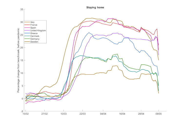
Using the Google data, we then created the following graphs, comparing the UK, France, Spain, Italy, Germany, Denmark, Sweden and Greece between mid-February and early May. To get a smoother image, we calculated a seven-day moving average. Countries are also ranked and coloured in the graph legends according to their average reaction over the whole period (meaning a country’s colour can differ between graphs).
What were the differences between countries?
Let’s start with people staying at home.
For a good part of April, all these countries except for Sweden were officially in some form of lockdown, with measures in place banning non-essential movement. However, behaviour varied substantially.

In Spain, Italy and France, time spent at home rose early in the pandemic by 30-35%. Even the most outdoorsy people must have stayed home for at least 10-12 hours before the lockdown, so this means at least three-to-five extra hours were spent at home per person – for most even more. This reflects these countries’ strict lockdowns: they banned all events, limited outdoor exercise, and in France’s case, required documentation to go outside.
Germany and Denmark were more relaxed; the rise in staying home was about 15%, reflecting their partial lockdowns. Sweden’s increase was even lower at 8-10%.
The UK was somewhere in between, reacting late but then strongly, with a rise of about 20-25%. The delay reflects its lockdown beginning later – on March 23 – though it is interesting that some people were already staying home before its lockdown began.
Greece is an interesting case, as it reacted relatively early and strongly, but started relaxing in late March, with a strong effect by mid-April, long before its non-essential movement measures were lifted on May 3. This might indicate that compliance is a matter of perceived risk. Greece kept its COVID-19 cases and deaths remarkably low, which may have caused people to relax.
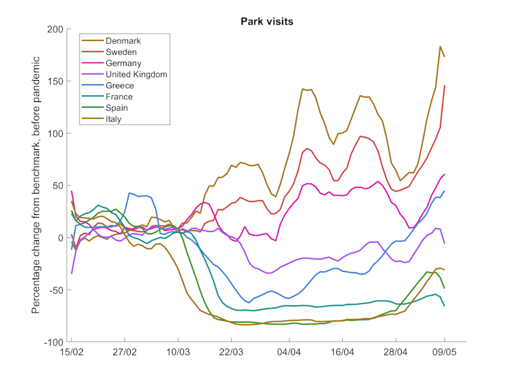
The mix of how people spent their outdoor time also differed. For example, the next graph presents the park visit data.

For most of April, Sweden, Denmark and Germany saw a rise in the time people spent in parks (including national and local parks, public gardens and beaches). At the same time, Italy and Spain saw 80% drops. Greece and the UK are again somewhere in the middle, seeing a drop initially but coming back to the benchmark in early May. In Greece’s case we actually see a rise of almost 50% lately compared to the benchmark – again suggesting that fatigue may have set in, in combination with good weather and a lack of perceived risk.
Germany’s park visit data is further evidence that lockdown measures do not fully determine behaviour, and that people have their own motives. Its graph line is somewhat similar to Denmark’s and Sweden’s, countries with less strict official policies; the country with the most similar policy on going outdoors was the UK, whose line shows a decrease instead of an increase.

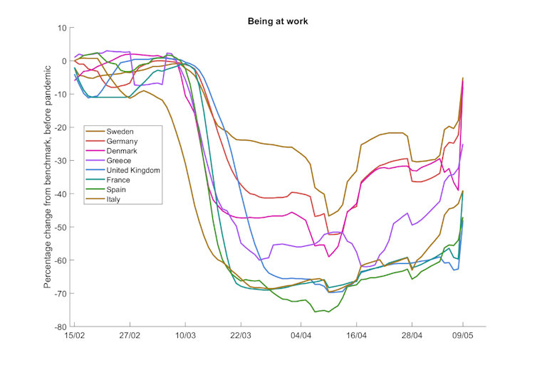
Lastly, let us look at time spent at workplaces. Again, in some countries people were going to work almost as much as before, while in others there were drops of 70-80%. Spain and Italy banned all non-essential work – a measure that went beyond the restrictions of all other countries – so it is not a surprise to see these at the bottom of the graph. We can see, though, the effect of Spain allowing some sectors to open up again on April 14.
What should we do with this data?
Behavioural fatigue, a much-maligned term during the UK government’s handling of the crisis, is now an issue that can be discussed properly. While lockdown measures were still in place, people around Europe started leaving their homes more. It’s clear that adherence to lockdown decreased over time.
Governments now need to investigate whether this affected the spread of disease. Is staying at home a solution? And if people do not stay at home, does it matter where they go? Answering these questions might allow governments to design an optimal lockdown policy mix that, say, allows people to go to parks, but not mingle in shops and railway stations.
As the threat of the virus is not eliminated, and second waves are expected around the world, gaining these answers will be very important.
Author: Sotiris Georganas, Reader in Behavioural Economics, City, University of London
This article is republished from The Conversation under a Creative Commons license. Read the original article.


