Our ability to perceive color is nothing short of a technical miracle — biologically speaking. But there is one color we can see that isn’t quite like the rest. This color, purple, is known as a non-spectral color. Unlike all its peers it doesn’t correspond to a single type of electromagnetic radiation, and must always be born out of a mix of two others.

Most of you here probably know that our perception of color comes down to physics. Light is a type of radiation that our eyes can perceive, and it spans a certain range of the electromagnetic spectrum. Individual colors are like building blocks in white light: they are subdivisions of the visible spectrum. For us to perceive an object as being of a certain color, it needs to absorb some of the subdivisions in the light that falls on it (or all of them, for black). The parts it reflects (doesn’t absorb) are what gives it its color.
But not so for purple, because it is a…
Non-spectral color
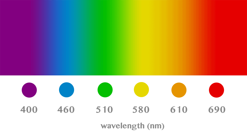
First off, purple is not the same as violet, even though people tend to treat them as interchangeable terms. This is quite understandable as, superficially, the two do look very similar. On closer inspection, purple is more ‘reddish’, while violet is more ‘blueish’ (as you can see in the image above), but that’s still not much to go on.
Why they’re actually two different things entirely only becomes apparent when we’re looking at the spectrum of visible light.

Each color corresponds to photons vibrating with a particular intensity (which produces their wavelength). Humans typically can see light ranging from 350 to 750 nanometers (nm). Below that we have ultraviolet (UV) radiation, which we can’t see but is strong enough to cause radiation burns on the beach, DNA damage, and other frightful things. Above the visible spectrum, we have infrared (IR), a type of electromagnetic radiation that carries heat, and which armies and law enforcement use in fancy cameras; your remote and several other devices also use IR beams to carry information over short distances.
The numbers above aren’t really extremely important for our purposes here; they describe the exact colors used for flairs on a subreddit I follow, and the wavelengths noted there will shift slightly depending on the hue you’re dealing with. I left the numbers there, however, because it makes it easier to showcase the relationship between light’s physical properties and our perception of it.
What we perceive as violet is, quite handily, the bit of the visible spectrum right next to that of UV rays. This sits on the left side of the chart above and is the most energetic part of light that our eyes can see (low wavelength means high vibration rates, which mean higher energy levels). On the right-hand side, we have red, with high wavelength / low energy levels.
Going through the spectrum above, you can find violet, but not purple. You may also be noticing that while we talk of ultraviolet radiation, we’re not mentioning ultrapurple rays — because that’s not a thing. Purple, for better or worse, doesn’t make an appearance on the spectrum. Unlike red or blue or green, there is no wavelength that, alone, will make you perceive the color purple. This is what being a ‘non-spectral’ color means, and why purple is so special among all the colors we can perceive.
More than the sum of its parts
If you look at orange, which is a combination of yellow and red, you can see that its wavelength is roughly the average of those of its constituent colors. It works with pretty much every color combination, such as blue-yellow (for green) or red-green (for more orange).
Now, the real kicker with purple, which we know we can get by mixing in red with blue, is that by averaging the wavelengths of its two parent colors, you’d get something in the green-yellow transition area. Which is a decidedly not-purple color.
That’s all nice and good, but why are we able to perceive purple, then? Well, the short of it is “because brain”. Although purple isn’t a spectral color in the makeup of light, it is a color that can exist naturally and in the visible spectrum, so our brains evolved the ability to perceive it; that’s the ‘why’. Now let’s move on to ‘how’. It all starts with cells in our eyes called ‘cones’
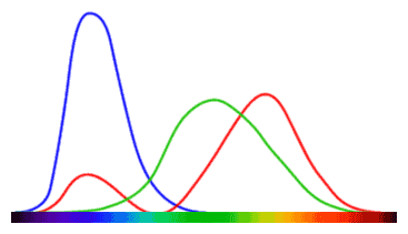
The chart on the left is a very rough and imperfect approximation for how the cone cells on our retinas respond to different parts of the visible spectrum. There’s three lines because there are three types of cone cells lining our retinas. While reality is a tad more complicated, for now, keep in mind that each type of cone cell responds to a certain color (red, green, or blue).
How high each line peaks shows how strong a signal it sends to our brain for individual wavelengths. Although we only come equipped with receptors for these three colors, our brain uses this raw data to mix hues together and produce the perception of other colors such as yellow, or white, and so on.
The more observant among you have noticed that cone cells that respond to the color red also produce a signal for parts of the visible spectrum corresponding to blue. And purple is a mix of red and blue. Coincidence?! No; obviously.
The thing is, while every color you perceive looks real, they’re pretty much all just hallucinations of your brain. When light on the leftmost side of the spectrum (as seen in the chart above) hits your eye, signals are sent to your brain corresponding only to the color red. Move more towards the middle, however, and you see that both red and green are present. But the end perception is that of yellow, or green.
What happens is that your brain constantly runs a little algorithm that estimates what color things you’re seeing are. If a single type of signal is received, you perceive the color corresponding to it. If a mix of signals is received, however, we perceive a different color or hue based on the ratio between signals. If both green and red signals are received, but there’s more of the red than the green, our brains will tell us “it’s yellow”. If the signal for green is stronger than that for red, we see green (or shades of green). The same mechanism takes place for all possible 9 combinations of these colors.
That bit to the right of the chart, where both red and blue signals are sent to the brain, is where the color purple is born. There’s no radiation wavelength that carries purple like there is with violet or orange. The sensation of purple is created by our brains, sure, but the reason why it needs to be created in the first place is due to this quirk of how the cone cells in our eyes work. From the chart above you can see that cells responding to green pigments also show some absorption in the area corresponding to purple, but for some reason, our brains simply don’t bother with it.
From my own hobbies (painting) I can tell you that mixing violet with green produces blue, but mixing purple with green results in brown. Pigments and colored light don’t necessarily work the same way, this is all anecdotal, and I have no clue whether that’s why green signals get ignored in purple — but I still found it an interesting tidbit. Make of it what you will.
In conclusion, what makes purple a non-spectral color is that there isn’t a single wavelength that ‘carries’ it — it is always the product of two colors of light interacting.
Are there any others like it?
Definitely! Black and white are prime examples. Since there’s not a single wavelength for white (it’s a combination of all wavelengths) or black (no wavelengths), they are by definition non-spectral colors. The same story with gray. These are usually known as non-colors, grayscale colors, or achromatic hues.
Furthermore, colors produced by mixing grayscale with another color are also considered non-spectral (since one component can’t be produced by a single wavelength, the final color can’t be produced by a single one either). Pink is most often given as an example, as is brown, since these can be produced using non-spectral colors (white and/or purple for pink, gray/black for brown).
Metallic paints also, technically, are non-spectral colors. A large part of the visual effect of metallic paints is given off by how they interact with and scatter light. A certain wavelength produces a single color; the shininess we perceive in metallic pigments can’t be reproduced using a single wavelength, as this is given off by tiny variations in surface reflecting light in different directions. The metal itself may well be a solid color, but our final perception of it is not. A gray line painted on canvas doesn’t look like a bar of steel any more than a yellowish one can pass off as a bar of gold. As such, metallic colors are also non-spectral colors.


