homehome Home chatchat Notifications


What are the average colors of the world? Data science offers a creative answer

Earth's color palette in a series of creative maps.

Tibi Puiu
July 16, 2021 @ 10:49 pm

share Share

In 1972, the Apollo 17 crew snapped one of the most famous photos ever taken, showing the Earth in all its glory for the first time in human history. The image has remained in the public consciousness as the ‘Blue Marble’ since it resembles the spherical agates we used to play with as children. Indeed, more than 70% of Earth’s surface is covered by oceans, reflecting a beautiful blue color.

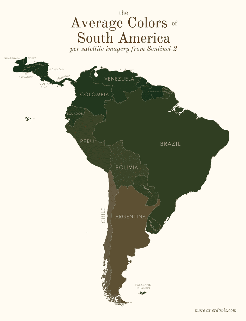
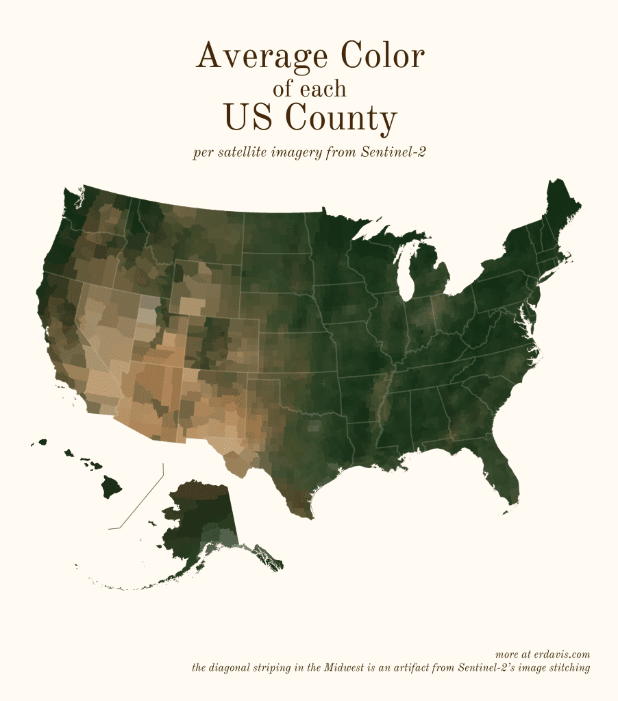
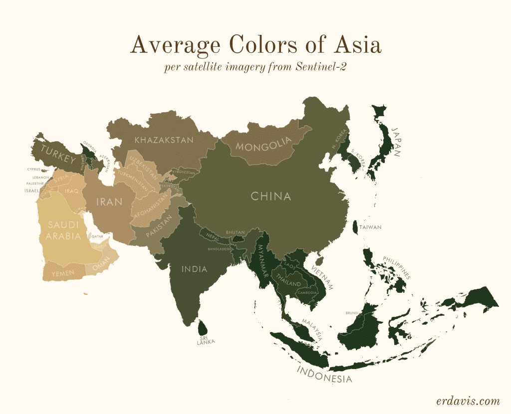
The rest of terrestrial Earth, however, is much more diverse, from deserts to dense rainforest — and this shows in the richer color palette as seen from space. Data scientist Erin Davis creatively illustrated this color palette in a series of maps showing the dominant color of various regions across the globe.

Davis used a dataset from the Copernicus Sentinel-2 mission, a constellation of two identical satellites in the same orbit, each equipped with a high-resolution multispectral imager capable of taking pictures of Earth’s land and vegetation in 13 different bands.
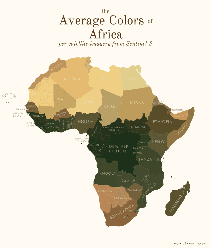
She then ran a script in the R programming language, which she coded herself, that assigned average colors to various areas, whether entire continents, countries, or states in the US.
In a short blog post on her website, Davis explained her process as follows:

  1. Wrote a script (in R) to find the bounding boxes of all the areas I was interested in
  2. In R, downloaded pictures of those areas from Sentinel-2
  3. In R, wrote a script that created a series of commands to:
    1. Georeference the downloaded image to create a geotiff
    2. Crop the geotiff to the borders of the area
    3. Re-project the geotiff to a sensible projection
  4. Ran that GDAL script
  5. In R, converted the geotiffs back to pngs, and found the average color of the png
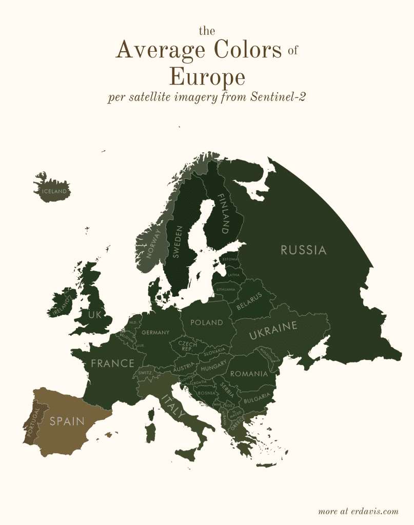
In the same blog post, you can find all the R scripts she used for this project, which you can adapt for your own data visualizations. Contrary to popular belief, data isn’t boring. It can be creative and beautiful with the right mindset.

share Share

The World's Tiniest Pacemaker is Smaller Than a Grain of Rice. It's Injected with a Syringe and Works using Light

This new pacemaker is so small doctors could inject it directly into your heart.

Scientists Just Made Cement 17x Tougher — By Looking at Seashells

Cement is a carbon monster — but scientists are taking a cue from seashells to make it tougher, safer, and greener.

Three Secret Russian Satellites Moved Strangely in Orbit and Then Dropped an Unidentified Object

We may be witnessing a glimpse into space warfare.

Researchers Say They’ve Solved One of the Most Annoying Flaws in AI Art

A new method that could finally fix the bizarre distortions in AI-generated images when they're anything but square.

The small town in Germany where both the car and the bicycle were invented

In the quiet German town of Mannheim, two radical inventions—the bicycle and the automobile—took their first wobbly rides and forever changed how the world moves.

Scientists Created a Chymeric Mouse Using Billion-Year-Old Genes That Predate Animals

A mouse was born using prehistoric genes and the results could transform regenerative medicine.

Americans Will Spend 6.5 Billion Hours on Filing Taxes This Year and It’s Costing Them Big

The hidden cost of filing taxes is worse than you think.

Underwater Tool Use: These Rainbow-Colored Fish Smash Shells With Rocks

Wrasse fish crack open shells with rocks in behavior once thought exclusive to mammals and birds.

This strange rock on Mars is forcing us to rethink the Red Planet’s history

A strange rock covered in tiny spheres may hold secrets to Mars’ watery — or fiery — past.

Scientists Found a 380-Million-Year-Old Trick in Velvet Worm Slime That Could Lead To Recyclable Bioplastic

Velvet worm slime could offer a solution to our plastic waste problem.