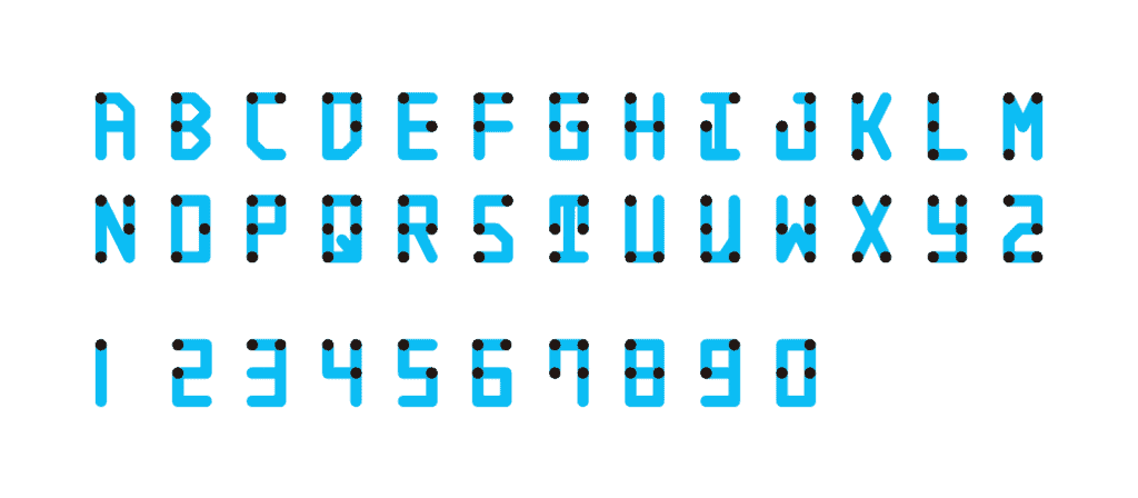
In a bid to make the Braille tactile system more familiar, Japanese designer Kosuke Takahashi re-designed the script to make it readable for everyone — no matter how well they see.

If you’re a sighted person, you probably regard Braille with a mix of awe and frustration. The flowings of dots look like coded messages as if someone wrote in Morse code — fascinating, but completely obscured to us. Our focus on visually-recognizable script across all languages and cultures has made Braille more of an exotic contender rather than a constant companion — definitely not something that the 285 million visually impaired people around the world can rely on to find dotted next to the tsunami of text the rest of humanity can access every day.
Kosuke Takahashi, a Japanese designer, thought that the dotted script would become much more widely-used if it could be read by everybody with the same ease. So, he set out do to just that.
“It all started from simple question, ‘How can I read braille?’ ‘Does it become a character if I connect the dots?’” he recounts. “Even though it is the same letter, it felt incongruous that sighted people could not read it.”
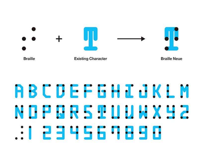
The largest issue Takahashi had to contend with is that Braille and Latin script don’t super-impose — the dots generally don’t stalk with the letters we’re used to seeing. Braille wasn’t designed to have a good correlation with the shape of visual characters, so you can’t just connect the dots and recognizable letters will pop out. For example, in Braille, numbers two and three are represented by two vertical dots and two side-by-side dots respectively.
After toying around with several designs that mixed the two alphabets together, Takahashi came up with Braille Neue. The typeface is perfectly legible to anyone with sight, but it’s built around a skeleton of Braille bumps — meaning everyone can read it.

Takahashi first tried drawing Japanese characters by connecting the dots, but soon decided it was a bad idea since he’d have to move them around so much they weren’t legible anymore. So he fell back on the (simpler) Latin alphabet. He admits that “V” and “I” are still probably not that easy to read and he’ll have to adjust them in the future, but overall, the typeface looks pretty good.
He hopes that Braille Neue could help make texts more inclusive, help sightless people navigate more easily, and possibly serve as inspiration for other graphics in public spaces.
“The biggest benefit is that one sign can work for everyone anywhere,” says Takahashi. “Additionally, this typeface does not require braille to take up additional sign space.”
He hopes to implement Braille Neue at the 2020 Tokyo Olympics and Paralympics and to use his experience designing this typeface to re-mix Braille and Japanese characters.


