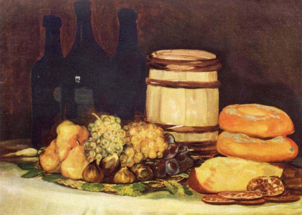
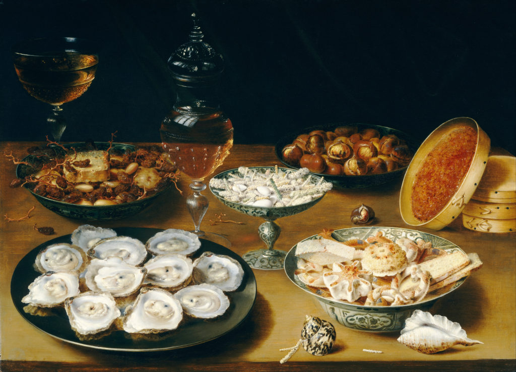
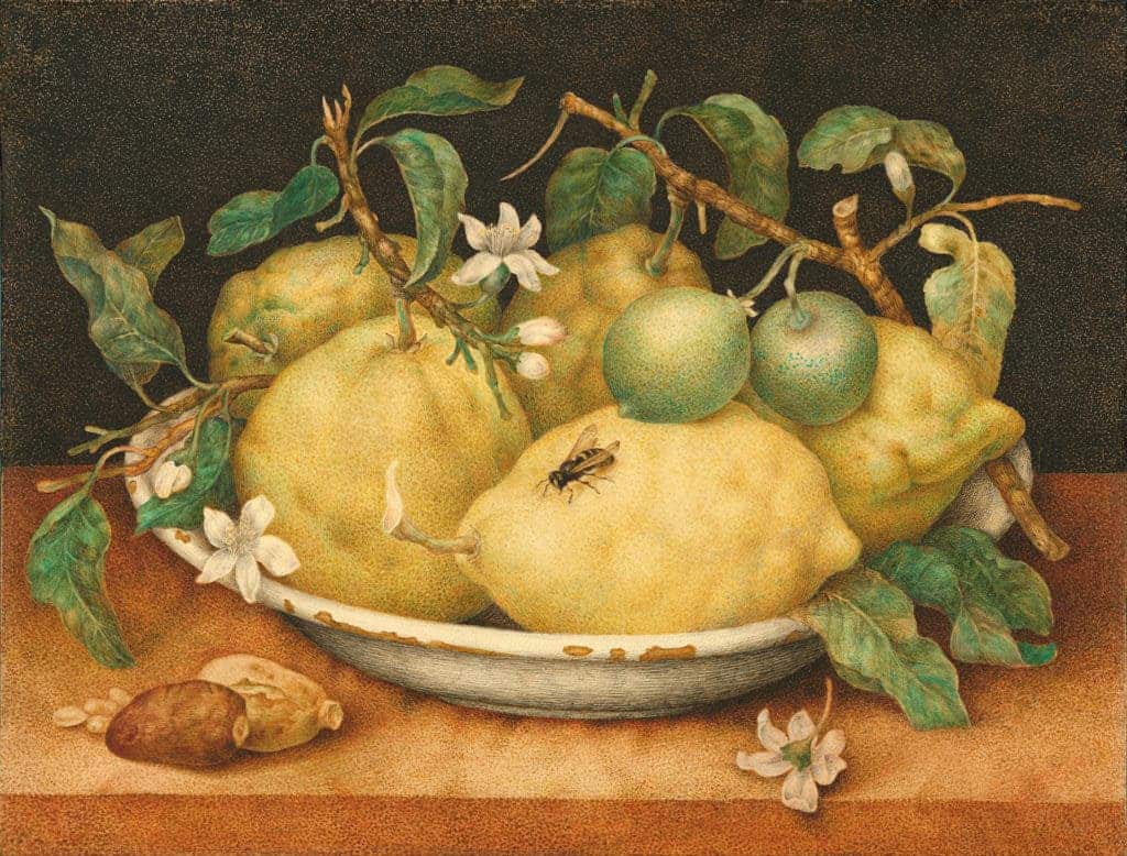
Often times, social media (especially Instagram) seems like an endless stream of food. Everyone wants to show you their craft ice cream or their goji pancakes. But do those photos really represent reality? A study says people have been misrepresenting food for over 500 years, starting with classic paintings.

To compare the painting above to an Instagram photo would almost be blasphemy — one is a delightful piece of art, the creation of which remains restricted to the mind and hands of talented painters, whereas the other can be done by anyone with minimal efforts; and yet, the two are pretty similar in scope. They want to immortalize delicious food, and put it in a good light. But while our Instagram feeds might be riddled with exquisite treats, most people usually eat pretty regular food. If you’d try to guess what people eat only by looking at Instagram, you’d end up with a wildly inaccurate idea. Could the same thing be happening with historical paintings of food?
Flaunting food
Researchers from Cornell University’s Food and Brand Lab wanted to see if that is the case. Brian Wansink, Anupama Mukund, Andrew Weislogel analyzed paintings of meals between the years 1500 and 2000. The idea was to compare how often an item might show up in paintings with how often it might show up on the table.
“To initially explore this question, 750 food-related paintings were screened down to 140 paintings from Western Europe and the United States depicting small, family meals,” they write in the study.
What they found was that common foods, such as chicken, eggs, and squash were rarely represented in paintings. Instead, shellfish often snuck into paintings, even when they weren’t commonly eaten — quite the opposite. In Germany, a country with a small coastline shellfish appeared in 20% of all paintings. Arguably, they were represented particularly because they were such a rare sight.

The argument is backed up by lemons. More than half (51.4%) of the paintings from the seafaring Netherlands contained non-indigenous tropical lemons. Apples were also a preferred subject of painters, likely due to their attractive shape and rich symbolism, being represented 302% more frequently than they appeared in family meals. Meanwhile, bread appeared 74% less frequently.
When life gives you lemons
Here are some other striking findings:
- 39% of paintings from the age of exploration featured shellfish
- 28% of paintings from the age of enlightenment featured lemons
- 26% of paintings from the age of enlightenment featured grapes

All in all, painters weren’t really concerned with offering an accurate representation of what people ate, and it’s easy to understand why. You want to have an aesthetically pleasing painting, especially when you have a patron who puts your own bread on the table.
“In general, paintings tend to feature meals with foods that were either aspirational to the commissioning family, aesthetically pleasing or technically difficult for the painter, or that encoded cultural, religious, or political information for informed viewers.”
In other words, they were more interested in flaunting haute cuisine — much like people are today. In fact, foodscapes faded in popularity until the rise of the internet, which brought them right back on the plate. People want to make life seem more interesting, and food is a very good place to start.
“When there’s pressure to tweet something different all the time, you try to make your life look more exciting,” says Brian Wansink, director of the lab and lead author of the study. “But it’s nothing compared to what they were doing 500 years ago.”
Aside from saying quite a lot about our society, this also raises an alarm flag for several other studies which were based on food paintings. These foodscapes might not be reliable at all, at the whim of every
Journal Reference: Brian Wansink, Anupama Mukund, Andrew Weislogel — Food art does not reflect reality. A quantitative content analysis of meals in popular paintings.


