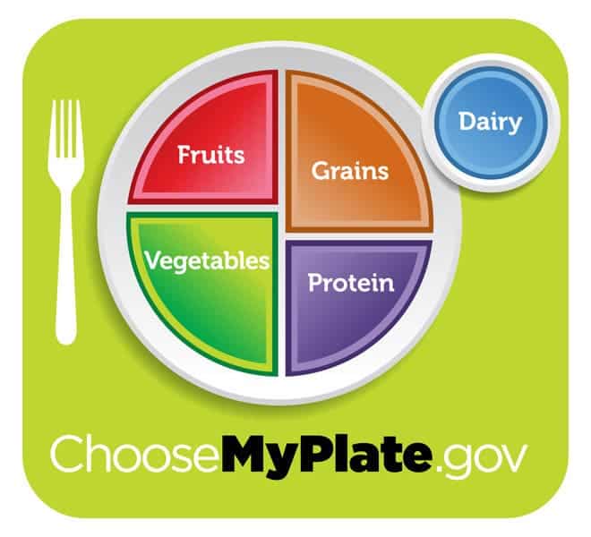
You know the food pyramid, right ? It shows you just approximately how much of each food element you should eat in order to be healthy and make the most out of your life. Well, the Food and Drug Association (FDA) decided that it’s no longer hip enough, and decided to give it a new redesign, with a web 2.0 touch. Thus, the food plate was born.
Four brightly coloured portions show your proportional intake of fruits, veggies, grains, and protein, along with a side dish of dairy. Sweets, oils, and fatty stuff are nowhere to be found. Officials hope that this will give people a clearer idea about what they should be eating and how much (proportionally) they should be eating than the food pyramid.
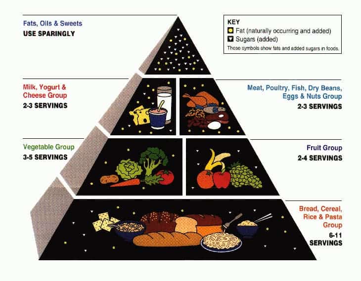
This is a picture of the classical food pyramid, released in 1992; it sparkled quite some controversy, not only because it ruled out butter almost totally, but because it deemed all fats as negative, instead of leaving some room for healthy fats, and it encouraged the exaggerated consumption of carbs, according to some experts.
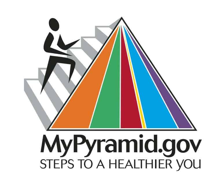
In 2005, the FDA rolled over another visual campaign, intentionally making it sleek and simple – but the graphic held absolutely no information whatsoever. The different colours were supposed to represent different food types, but how the heck am I supposed to know what purple means ?
All in all, it’s an interesting attempt, and it remains to be seen how the general public will embrace or refuse it. Meanwhile, you can find the whole campaign and additional details here.


