It’s easy to forget, in the current situation, that the world is still heating up severely. If the COVID-19 pandemic is a wave sweeping through the world, then climate change is a tsunami looming darkly on the horizon and already starting to strike. Yes, climate change is hitting us already, probably in more ways than we imagine.
Weather isn’t climate. You may get a colder month or even a cold year, but overall, the climate is getting hotter and hotter. To get an idea of how much it’s been heating, the 10 hottest years on record have all occurred in the past 15 years. It’s a striking stat, and 2020 was a perfect example.
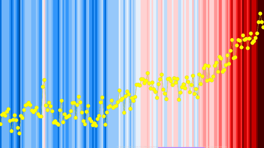
It’s easy to think, with all the talk about the pandemic decreasing emissions, that 2020 wasn’t that hot of a year. But depending on how you calculate, 2020 was either the hottest or second-hottest year in history. In fact, it perfectly fits the warming trend in the past few decades. Here’s a simple chart that illustrates this.
The chart was developed by Simon Jockers at Datawrapper, one of the visualizing platforms we’ve also used during the pandemic. It’s called a climate stripe chart, or a warming stripe chart, where the color of each stripe denotes the temperature in one year. This type of chart was first popularized by climate scientist Ed Hawkins who wanted a simple way to visualize the complex process of climate change. Nowadays, the scope of this type of chart has also been extended to other types of charts (like sea level rise, or rainfall, explains Jockers).
“I wanted to communicate temperature changes in a way that was simple and intuitive, removing all the distractions of standard climate graphics so that the long-term trends and variations in temperature are crystal clear. Our visual system will do the interpretation of the stripes without us even thinking about it,” said Hawkins in 2018.
It’s more striking than just a simple line or chart because our brains tend to react better to visual colors than something requiring extra thought. Here’s an example:

Hawkins’ idea proved to be exceptional. Since he first published it, thousands and thousands of such charts have been published, sending a strong message at a single glance.
If you look at localized data, it sends an even stronger message:
If you’d like to make your own charts for your own area, Jockers’ post has everything you need to know, and the Datawrapper blog is full of good DIY chart and map examples.
If you’d like to know more about what you can do to tackle climate change, here are a couple of good places to start with.


