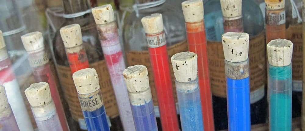
The Straus Center for Conservation and Technical Studies at Harvard Art Museums is one of the most colorful places in the world. It houses over 2,500 pigment samples placed in tincture bottles behind tall glass cabinets, reminding of old medicine bottles. We owe it all to Edward Forbes.

Professor Edward Forbes was an interesting man – a true naturalist. When he wasn’t collecting insects, shells, minerals or fossils, he was usually reading or writing poetry. He went on to work in marine biology and hold the presidency of the Geological Society of London becoming one of the most respected men in the field. Initially giving up on an artistic career, he never renounced his passion for color.
“Every time he traveled he would bring things back with him,” Senior conservation scientist Narayan Khandekar told WBUR. “And these are Japanese pigments and binding media that were collected in the 1930s. And we have one of our prized possessions, this ball of ‘Indian yellow,’ which is made from the urine of cows fed only on mango leaves.”
By the 1920s, Forbes had amassed containers of “deep blues, rich purples, vibrant yellows, and myriad other colors from his travels to Europe and the Far East.” Word got through of his collection, and both art lovers and scientists started contributing to it. Today, there are over 2,500 color containers which you can visit in the Harvard Art Museum.
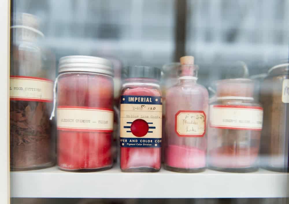
“In thinking about the role of a university museum, he was the first to conceive of it as ‘a laboratory for the fine arts,’ ” noted research curator Francesca Bewer in her book “A Laboratory for Art: Harvard’s Fogg Museum and the Emergence of Conservation in America, 1900–1950.”
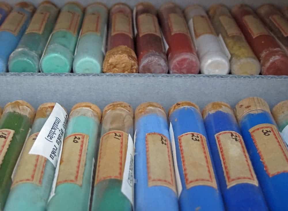
But the museum isn’t only a window to the past. Initially only focusing on ancient pigments, after World War II the collection also started amassing contemporary pigments that have only recently come into the market.
From what I could find, this is the largest collection of its kind in the world and a feast on the eyes. Sure, one could easily dismiss it- after all, colors are everywhere and we generally take them for granted. But we shouldn’t. People went through great trouble to achieve colors in pre-modern times, and to this day, some colors are difficult to create.
A Blue as Rich as Gold
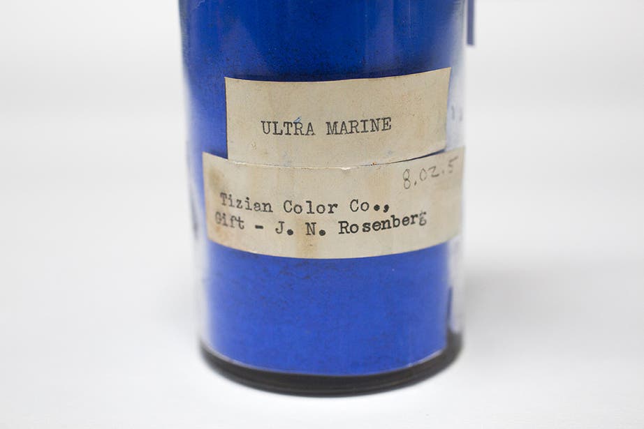
A great deal of skill was involved in creating this hue from the minerals carefully extracted in the quarries of Afghanistan. Preparers would grind the rock into small pieces, but still “large enough to contain the blue color,” said Khandekar. The color was mostly used in Medieval paintings and it was worth its weight in gold in those times.
Royal Purple from the Ocean
Purple was the color of royalty, but that wasn’t just a fashion statement – purple was incredibly difficult to create in ancient times. The key ingredient lurked in the ocean waters. A secretion from the predatory sea snail Bolinus brandaris (originally known as Murex brandaris) was the key to this deep purple hue. The color was so valued that the Byzantine emperors forbade anyone outside the imperial court from using the violet dye, lending it the distinction “royal purple.”
Shiny Metals
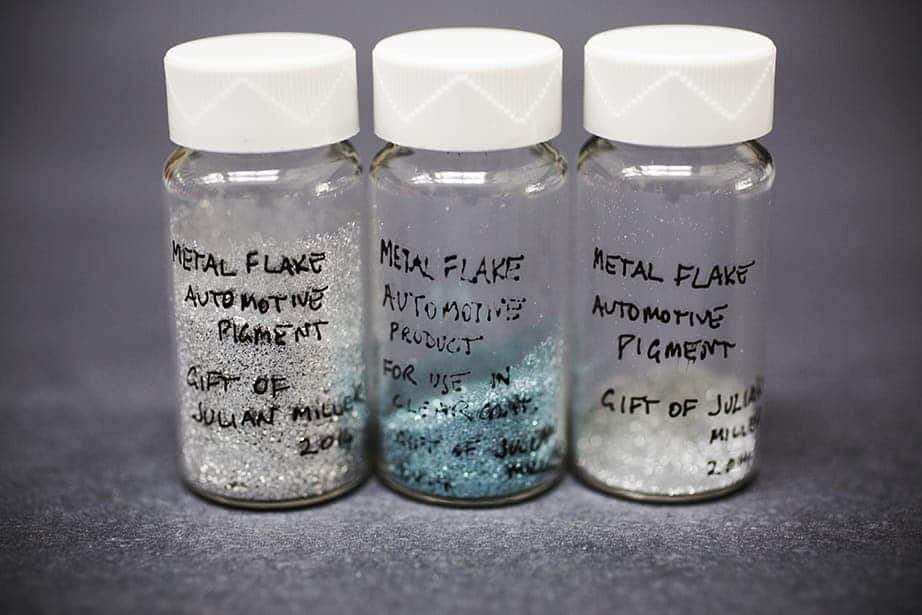
These small jars hold inside shimmering metal pigments, often found in automotive finishes in the 20th-century pop art. English painter and collage artist Richard Hamilton was fond of spraying the metal flakes onto his work, giving a very distinct look.
“They are kind of extraordinary, these tiny bits of metal that you find on various works.”
Kermes Crimson
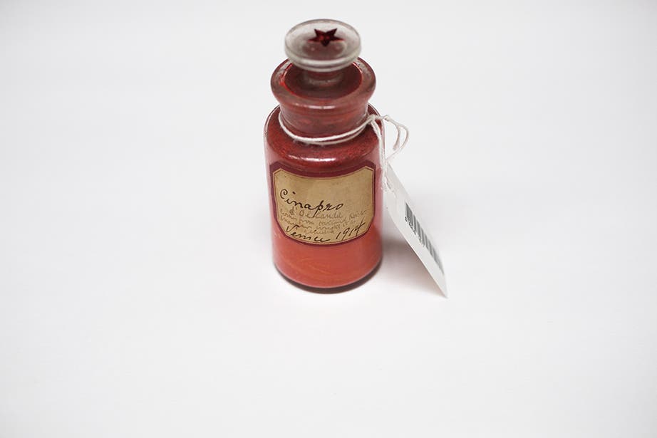
These are tiny samples of kermes. Kermes is a red dye derived from the dried bodies of the females of scale insects that live on the sap of certain trees, especially Kermes oak tree. Kermes is also the origin for the word “crimson”.
Killer Colors
Some pigments need to be handled with extreme care, because they are poisonous. The yellow-hued orpiment and the red-orange realgar derived from arsenic sulfide minerals are especially dangerous. But it’s not just those.
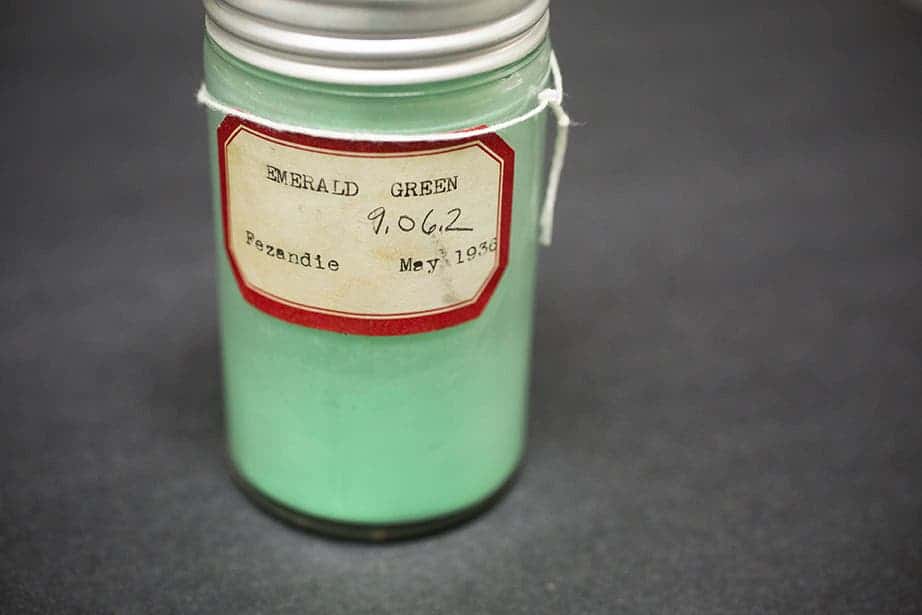
This crystalline powder called copper acetoarsenite is a dazzling emerald shade of green that was used in paintings, but that could be very harmful to the artist’s health. Very cheap to make, it was used in many valuable paintings including Van Gogh’s “Self-Portrait Dedicated to Paul Gauguin”. It was even popular as a house paint in the 1800s and even early 1900s, although its toxicity was known at the time (at least by some).
Rothko Red
We can’t talk colors without talking red, and this particular shade is definitely worthy. After analyzing lithol red, researchers developed a technique to use light from a projector to augment the faded colors on a series of Rothko murals that the artist painted for Harvard.
“We found that when you tried to fade Lithol red as a powder, it was incredibly stable, but when you mixed it with ultramarine blue and a binding medium it became incredibly light-sensitive. Our analysis helped us understand what was going on with the paint,” said Khandekar. “To be able to treat and best look after works of art, you need to know all the things that are going on with them, and the Forbes Pigment Collection helps us do that.”

