The first atlases contained maps that gave explorers the information that they needed to exploit the resources and people of the world. Now, that era needs to be over, argue the creators of the Atlas for the End of the World. This Altas provides the antithesis to the idea of exploitation and instead provides detailed maps of the earth’s hotspots and the information to best protect these areas. Hotspots are critical because they contain unique biodiversity. These maps give governments and planners the tool to reach their 2020 United Nations conservation targets and are also fun to explore for curious individuals.
Atlas for a new era
Richard Weller, Martin, and Margy Meyerson Chair of Urbanism, and Professor and Chair of Landscape Architecture at the Pennsylvania School of Design published the Atlas for the End of World online where it is accessible to everyone. It collects hundreds of maps that are focused on the 36 hotspots in the world and their management. Each hotspot should have 17% protected by 2020, according to the targets set by the United Nations.
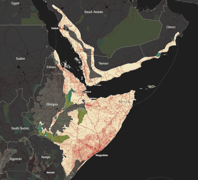
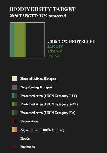
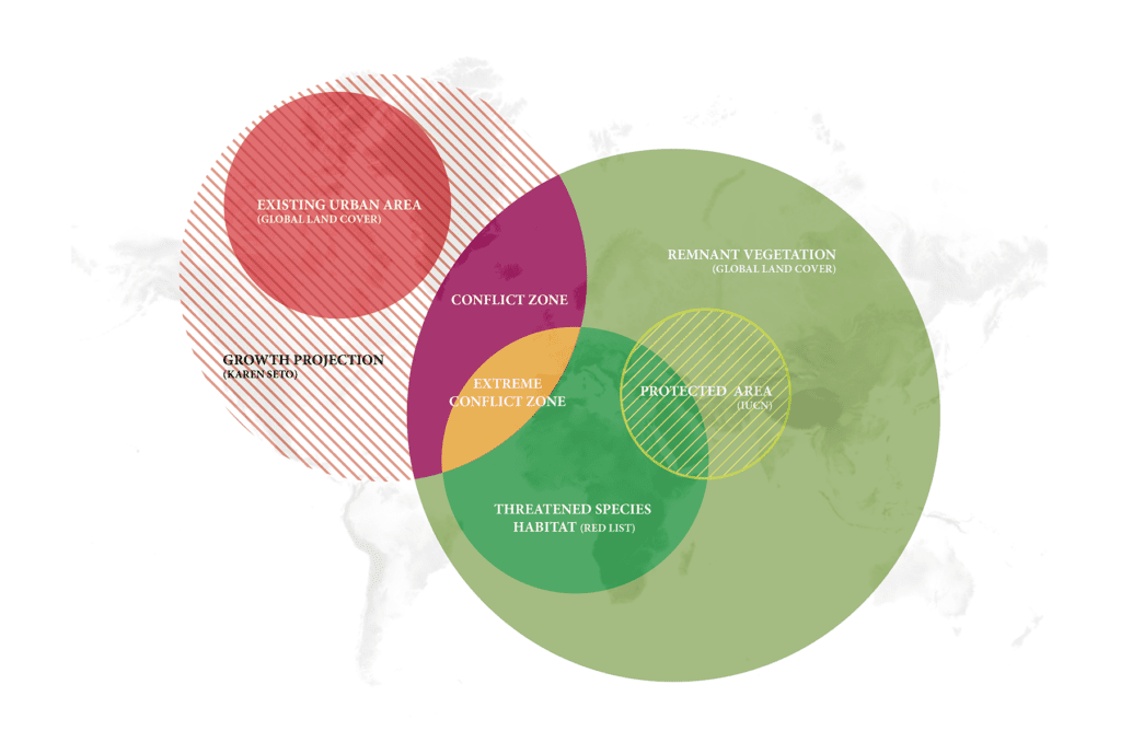
Each hotspot has their own map with different land uses displayed: the category of protected area, urban area, agriculture, roads, and railroads. There is also information about biome types, ecoregion, native plant and animal species. Clear graphs show exactly how much remnant habitat is left and how much new protected land is required to meet Aichi targets. Urban growth and agriculture are projected, showing growth and areas where there may be a conflict for rare species.
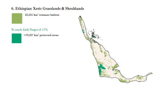
“If you really want to make a difference, this atlas shows you where to go,” said Richard Weller.
How are the targets being met?
The hotspots exist in 142 different nations and are distributed all over the world, making it truly a global issue. Only 14 of the 36 hotspots have achieved the 17% target of protected areas. The others are further away to achieving the goal in three years time. The regions that are doing the best are New Zealand (33% of area protected), the Cape Floristic Province in South Africa (25.7%), and the tropical Andes (23.8%). The worst are the horn of Africa (7.7%), the Atlantic forest down the coast of Brazil in Paraguay and Argentina (8%), the Caucasus (8.7%), and Madagascar (9%).
The maps can be used to decide where the extra protected land could be allocated where it would be out of the way of development and connected. Having large patches of land is not enough, connectivity is important so that species that have multiple healthy populations that can migrate and adjust to land and climate changes. This is the tricky part.
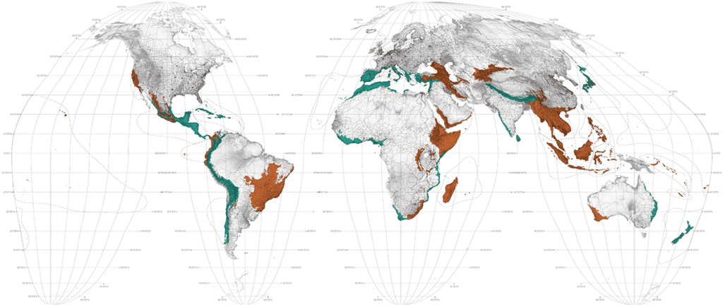
Cities that are expanding in the region may also threaten the biodiversity contained within. In these main 36 hotspots, there are 422 major cities, 383 of them are expanding directly into important species habitat. Most of these cities don’t have any sort of land-use planning and don’t take the whole region into account.
Hopefully, this Atlas will inform decision-makers in hotspot nations to make better decisions and prioritise conservation efforts. If planned well, the regions could still be economically beneficial as well as protect key biodiverse areas. All this requires is careful planning; now there is a tool to make that even easier.


