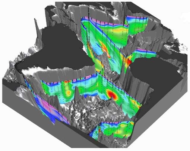
Researchers have developed a three dimensional atlas which shows the concentrations of iron dissolved in the world’s oceans. This monumental achievement can be very valuable for scientists, but also for policy-makers.
Why is mapping iron in the oceans such a big deal ? Well for starters, iron plays a crucial role in the oceanic carbon cycle, as it is a key nutrient for phytoplankton. When phytoplankton bloom, they absorb carbon dioxide from ocean water, taking it to the depths of the ocean as they fall. The amount of iron they have available directly controls how much they can expand – but researchers are still struggling to understand the relative importance of different iron sources, such as atmospheric dust, continental erosion and upwelling of lava at sea-floor mid-ocean ridges. Basically, they want to understand if all iron sources are made equal, and if not (which seems more likely), what are the relative differences.
Now, a stunning 3D map finally shows iron concentrations in the water in detail. You can easily observe features such as plumes of iron extending for up to thousands of kilometres at the mid-Atlantic ridge as well as the coastal erosion patterns. The map doesn’t reveal one iron source dominating over the others, but rather it shows that all of them play an equally important role.
Modellers should now stop debating over what source is more important, and focus on more relevant issues, such as the ways in which iron moves through the system, says Robert Anderson, a chemical oceanographer at Columbia University’s Lamont–Doherty Earth Observatory in Palisades, New York.
“Some of these processes we’ve had hints of before, but we’ve never seen them so clearly,” he says.
The map was released today, 5 February at the 2014 Ocean Sciences Meeting in Honolulu, Hawaii, and is the first major achievement of GEOTRACES, an international programme launched four years ago to chart trace metals throughout the world’s oceans.
Source: Nature doi:10.1038/nature.2014.14774


