In an effort to show the actual effects climate change will have on each of our lives in the future, the National Oceanic and Atmospheric Administration (NOAA) put together some chilling maps showing a scorching future.

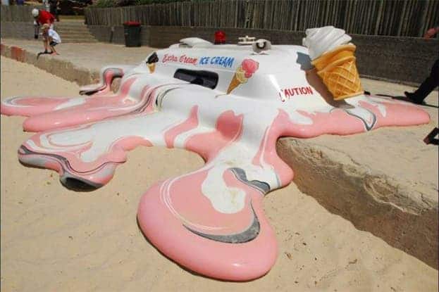
Image via thisiscolossal.
Climate change is going to cause a whole lot of changes to the world as we know it. Sea level rise, species extinction, and food and water uncertainty for many. While we’re aware of these future threats, the problem is that we’re just not very good, from a psychological point of view, at dealing with future problems that require collective action. It doesn’t feel like it matters to us directly, it doesn’t feel like we can do anything about it, so we don’t really care. Our brains sport more of a cross-that-bridge-when-we-get-there type of wiring.
That, in the context of climate change, is a really bad strategy. It takes time for this damage to build, but it takes just as long for us to work on preventing it — and much longer to fix it after the deed is done.
Would you like some ice with that?
NOAA, however, knows what’s up. NOAA is also sneaky and knows what everybody hates: scorching summer temperatures. So, to help us better understand what path we’re walking down, they’ve compiled some maps to show just how hot things are going to get by the end of the century. For example, here’s what mean July temperatures looked like in the US in 2010 — and how they will look in 2090.
Scorching, right? Well, don’t take out the ice-cubes just yet because this is one of the better-case scenarios — one where we pursue and achieve fairly ambitious reductions in greenhouse gas emissions and reforestation. Yep, fairly ambitious greenhouse gas reduction and reforestation. With the new, 2.0, ‘clean’ coal administration currently ruling the US, neither of those targets seem very likely, do they?
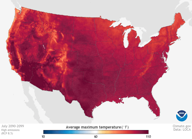
NOAA agrees; that’s why they’ve also made predictions for a business-as-usual scenario, in which we keep polluting as we do now, and make no policy changes in regards to the environment. If we go down that road, July 2090 looks like a time where no amount of ice cream will cut it:

For those of you with an unnatural fear of metrics, deep red (the thing covering most of the US in the picture) corresponds to average daily highs of 100°F (37.8°C). Daily. For a month at least, year after year, after year. I don’t know about you guys, but when I see the thermometer hitting 30°C I know it’s going to be a bad day. At 35°C, I can’t function any longer. I just fill my bathtub with cold water and camp in it.
I’m not so special in that regard; people and high temperatures don’t seem to mix that well. Currently, some 658 people die from extreme heat in the US every year, mostly in states such as Arizona or Texas. That number is bound to skyrocket as these states themselves, along with the rest of the US, start getting hotter.
Winters will also warm up. Even under a best-case-scenario, average highs during winter months will look something like this (the video starts with current mean temperatures).
I like what NOAA did with these maps because I feel it helps put that infamous 2°C Paris goal into context. It’s often used as a reference point in many discussions around climate change, and a benchmark that many official bodies, scientists, and publications use — but it doesn’t convey much to the average Joe.
Knowing that global temperatures will increase by 2°C doesn’t sound like much, and there’s probably a lot of ‘globe’ around so that doesn’t tell me much about what I’m going to have to face. Even worse, that figure is the mean annual temperature — putting one more layer of abstraction between it and what effects I’ll feel.
Hopefully, NOAA’s work will help us better understand what’s waiting for us down the road. They note that most people in the US will have to contend with scorching heat as soon as 2050 — and such conditions will take their toll on the economy and our quality of life (high temperatures, among other things, make it harder for us to sleep).
Our lawmakers do have the power to change where we’re heading. Quite possibly, most of them don’t particularly care — but they do care about votes. Call them up, ask them why they want you to suffer through 100°F during lunch. Then ask why you should vote for them.


