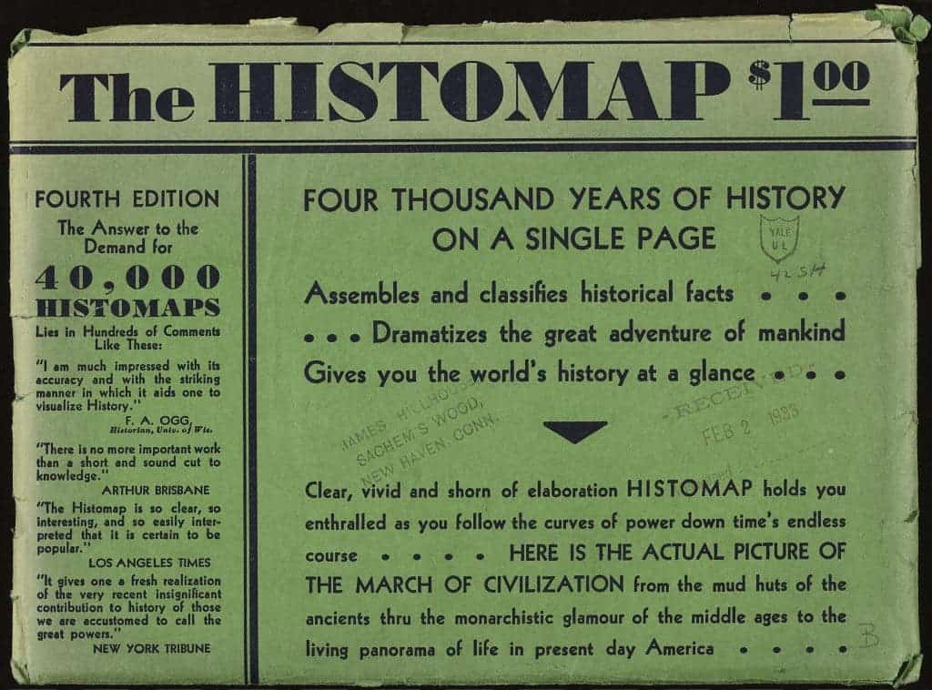
Created by John B. Sparks and first printed by Rand McNally, the Histomap started selling in 1931 for the price of US$1. Folded in a green cover that advertised it as “clear, vivid, and shorn of elaboration,” and promising to “hold you enthralled”, the 5-foot-long work of historic awesomeness aims to deliver big:
The actual picture of the march of civilization, from the mud huts of the ancients thru the monarchistic glamour of the middle ages to the living panorama of life in present day America.

And it does so splendidly.
This giant, ambitious chart fit neatly with a trend in nonfiction book publishing of the 1920s and 1930s in which all-encompassing subjects were refined into a form comprehensible even to the most uneducated layman. The chart emphasizes domination, using color to show how the power of various “peoples” ebbed and flowed throughout history.

While the Y axis clearly represents time, what does the X axis (marked “relative power of contemporary states, nations, and empires”) represent? What does “Power” mean to mister Sparks, and how does one determine the absolute measure of it in a system as complex as human civilizations? Is it a zero sum game, where countries and empires vie for control of as many “shares” of a finite resource (i.e. power) as possible? Is power measured in swords, in gold coins, in acres of land or head of cattle or written words?
Regardless of exactly how the mapmaker determined the power of each civilization, the Histomap is a work of stunning beauty and a good (if possibly subjective) glimpse of the efforts and success of civilizations in human history. Sparks followed up on the success of this Histomap by publishing at least two more: the Histomap of religion (which I’ve been unable to find online) and the Histomap of evolution.


